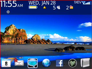
Ive said time and time again - the stock Verizon theme is AWESOME. The best icons out there, imho, 5 customizable home page icons...You are good to go. What I can't stand about MOST themes that use non-standard, colorful icons like in my Bold or iPhone themes. Once you install a few 3rd party apps with their colorful icons you're BB looks a little weird. You have all these translucent, mono-colored icons for all the preinstalled BB apps and then you have Viigo, Google Maps, etc sticking out like a sore thumb with their bold colors.
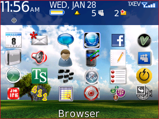
Now, having professed my love for the standard VZW theme. I have been using a 3rd party theme for about a month. It fits 7 icons on the bottom of the homescreen and it installs with a cool background... Once I get sick of this theme, I'll be back to the VZW!


![[4 pc] 2N6284G Darlington NPN Power Transistor 2N6284 OnSemi picture](/parts/img/g/cvIAAOSwtEtmNNM1/s-l225/-4-pc-2N6284G-Darlington-NPN-Power-Transistor-2N62.jpg)